5 Smart Places to Put CTAs on Your Private Practice Website to Turn Visitors into Clients

In my earlier post, how to increase engagement on private practice website, I wrote about proper positioning of CTAs for higher engagement. A well-placed Call-to-Action (CTA) can gently guide visitors from curiosity to action, whether that’s booking a session, signing up for a newsletter, or scheduling a free consultation.
But a improperly placed CTA can take the above advantages away. So placing CTAs at right positions is very important. In this post, I have listed down five strategic places on a private practice website to position CTAs so that you can turn website visitors into paying clients.
1. Above the Fold
Above the fold area is that area on a private practice website is that area which is visible to your visitors without scrolling. This area that visitors see before scrolling is prime real estate of your website. This is the area where a user lands and interacts with your website in the first place.
This above the fold area on your therapist private clinic website is the best place to have clear message CTAs. Almost 90% of users use this area’s CTAs to call or fill enquiry form. So it needs to be optimized well.
Add clear CTAs in above the fold area like a call to action button with text “Book Your First Session Today” or an enquiry form. I would suggest to add both because not every user call in the first place, some also send private message which can be done through a enquiry form. Adding the form and a button ensures people immediately know what step to take.
Also make sure that the buttons and forms you use should not be of very bright colors or contains text which is hard to read. Keep them simple, visible, and aligned with your main goal.
You can also pair your CTA with short, reassuring statements like “Take the first step toward feeling better.”
2. At the End of Your Service Pages
Many users like to read the full content before deciding to take action. They scroll down to the end of the page. When they feel that you are the perfect match for their condition, they look for the contact option and that’s the perfect time to invite them to take the next step.
You should place a CTA such as “Schedule a Consultation” or “Start Your Therapy Journey” at the bottom of each service page. This will help the user to engage and connect with you easily without scrolling back to the top. You can even direct them to an enquiry form where the user can share the details confidentially or can even attach a small enquiry form at the end of the service page.
Like the above the fold CTAs, don’t use very bright colors or texts that are hard to read. Use a contrasting background for the therapist enquiry form for better visibility.
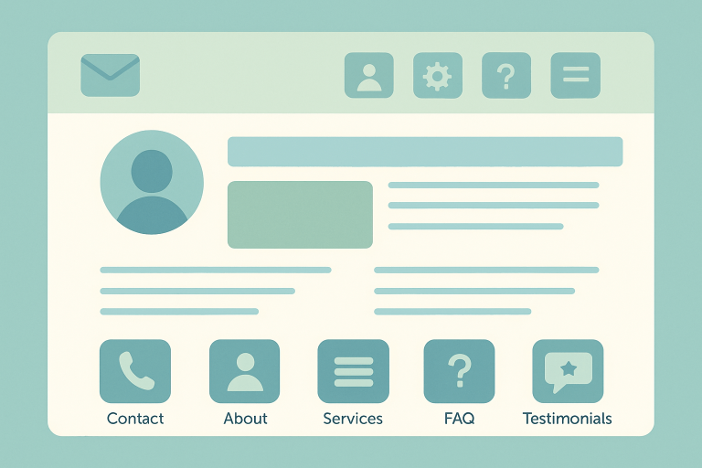
Also read: 5 Essential pages every private practice website must have
3. In the Website Header or Navigation Bar
Just like the above the fold area, navigation bar is also an important area to place CTAs. Many private practice therapists make this mistake of avoiding adding CTA buttons in the navigation bar. But that’s not a good practice.
Your navigation bar follows visitors across your site, making it a consistent spot for a CTA. A button like “Book Now” or “Get Started” in the header ensures no matter where someone is, they’re only one click away from reaching you. Give it a contrasting color which is different from your website’s navigation bar. This will make the CTA button to stand out from the menu navigation options.
You should also create a website header at the top of your website with your clinic’s email address, phone number and address. These details at the very top will help the user to contact you easily.
Also read: Basic vs. Client-attracting private practice counselling website difference
4. Within Blog Posts or Resources
Writing regular blogs is an important part of therapist marketing strategy. When you write blogs covering the problems your clients may be facing you build trust with your user. Not only with user, the Google and other search engines starts considering you as an authority in the particular field and start sending you more users organically though their search pages.
Placing helpful CTAs in the blog content is one of the best strategy to attract client to your private practice clinic. For example, if you are an anxiety therapist then after a post about managing anxiety, you could add “Ready to talk to someone about your anxiety? Schedule a free 15-minute call today.”
This you should do this contextually between the content. Like after 2-3 paragraphs, you can add a CTA according to the conversation flow of the topic. Like if the conversation is going on like, body shivers during an anxiety attack. At that point you can add, Talk to understand why this happens? or Learn how to manage this condition? in the form of a button or form. This will keep the content flow smoothly without looking like promotion of your service.
5. On Your Contact Page
Many of you will think that Contact page is the most obvious place to contact someone. So why listed in this list? Yes, you are right. Contact page is the most obvious place to contact but it can also be improved. You can strengthen your contact page with assuring sentences like “Ready to take the first step toward change? Schedule your consultation today.” and clear CTAs, like “Book an Appointment Online” or “Schedule Your First Session Today.” This ensures they don’t just find your phone number but also see a direct way to take action.
Give your users multiple ways to contact you. Ideally a form, phone number, and a direct link to chat. This will help them to reach out to you in the way they want. Some don’t want to talk directly, so a form will work in this case, some users want to share their feelings, in this case online chat option can work, and for those who want to call directly, a direct phone number will work.
Conclusion
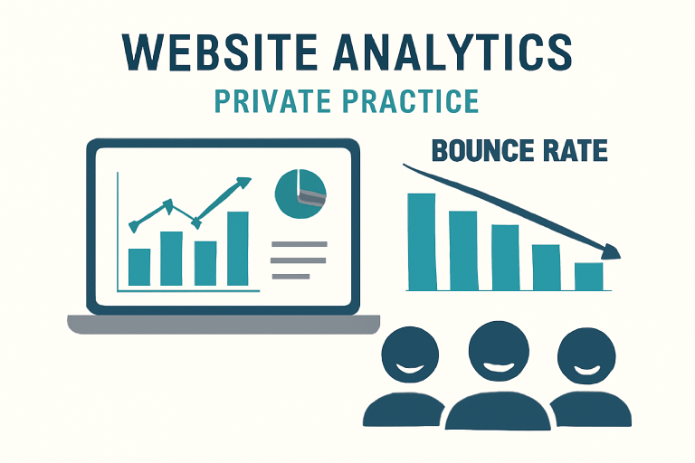
The right CTA in the right place can make all the difference between a visitor leaving your site and becoming your next client. By thoughtfully placing CTAs in these five areas on your private practice website, you create a natural pathway for people to move from browsing to booking. Having clear CTAs also decrease the bounce rate.
You are in a profession where users are in immediate need of help. They may not be feeling well, and with no direct option to contact you, they will leave the website more frustrated. So by placing the CTAs at the right position you are not only helping yourself but also your users to reach out to you easily.